I really love these Sankey diagrams applied to income statements!
It is so important to visualize annual report content in an appealing and explainable way.
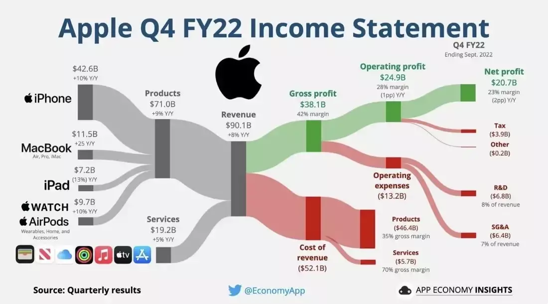
Here we have the income statement of Apple for Q4 2022 visualized: cost being deducted from revenue, resulting in profit. Furthermore, cost and revenue are split up into sub-categories. So, you can really drill down into the data.
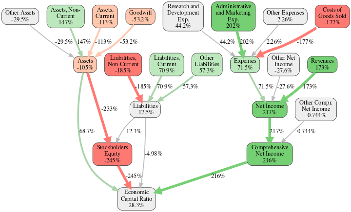
Here is the way how we represent the Apple balance sheet and income statement in our RealRate rating report:
Source: https://realrate.ai/ranking-area/2022-us-computers/
It is generated automatically using our artificial intelligence.
The red and green nodes respectively show strengths and weaknesses of Apple with respect to the whole computer industry. We call it eXplainable AI (XAI).
It is not a black box anymore. Instead, you can understand the cause of the most important key figures regarding a company’s financial strength.
Within two minutes you can grasp what is going on in that company without having to read a several hundred-page annual business report.
Enjoy the complete RealRate US Computer ranking here:
https://realrate.ai/ranking-area/2022-us-computers/
Main photo source: https://www.visualcapitalist.com/cp/big-tech-revenue-profit-by-company/